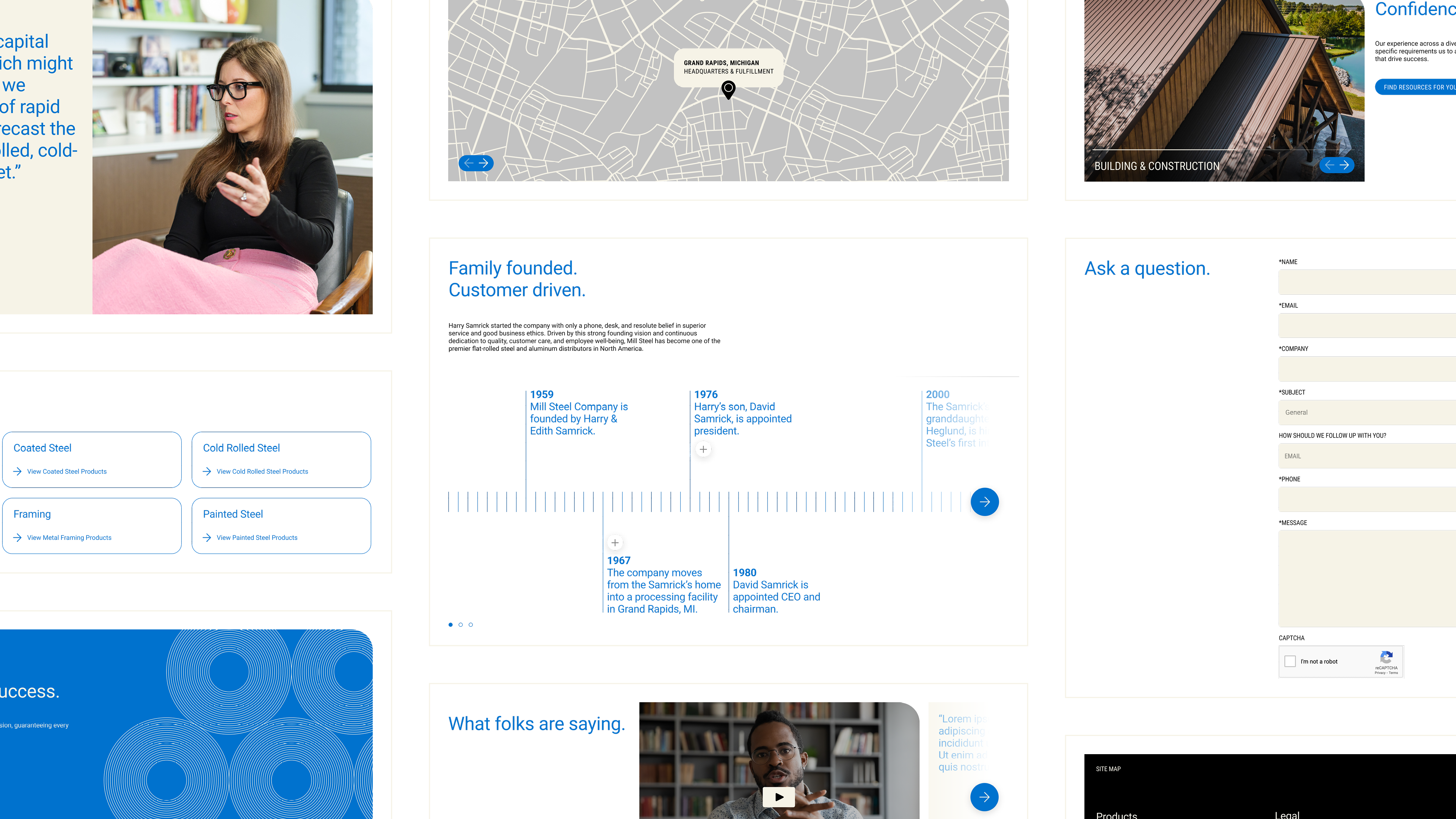
Mill Steel, one of the largest woman-owned steel service centers in the USA, had just recently gone through a branding effort. The brand refresh had become widely adopted across materials, but it left the website feeling dated.
Our task was to keep the brand elements largely intact, but create a website that communicated in a clear, contemporary way, surpassed industry competitors, and evolved the brand to reflect its industry prowess.
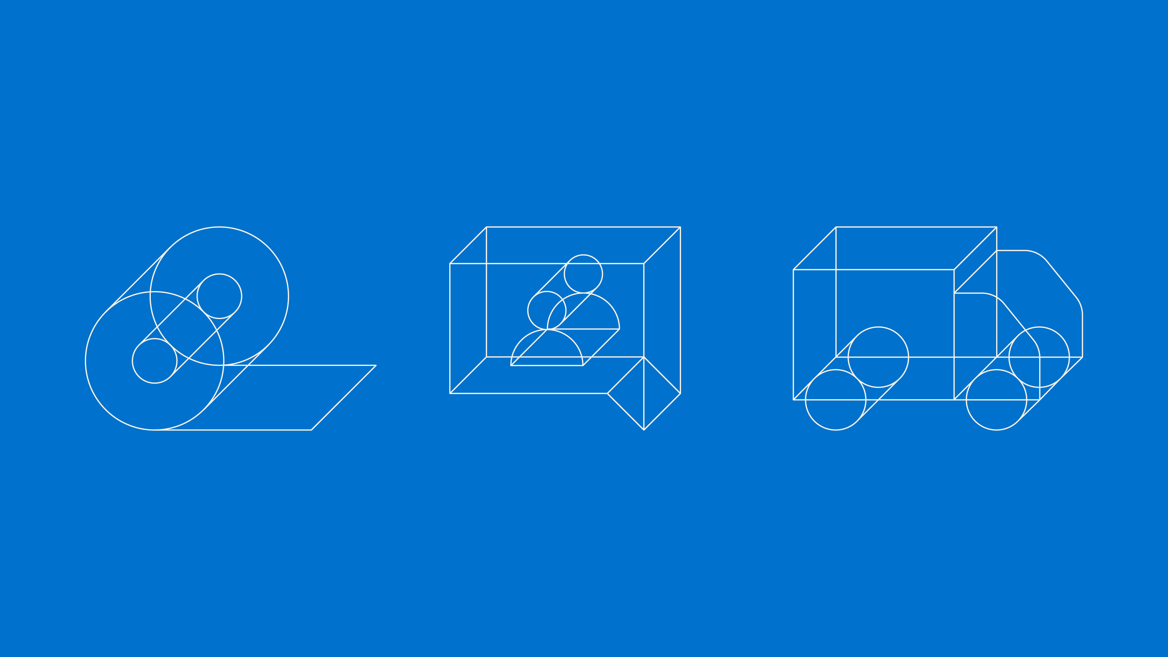
Alongside a complete messaging overhaul, we created a graphic system built on simple illustrations, rounded corners (derived from the logotype), dimensional icons, sleek typography, and an adjusted color palette that—all together—brought warmth and credibility to the brand.
Our task was to keep the brand elements largely intact, but create a website that communicated in a clear, contemporary way, surpassed industry competitors, and evolved the brand to reflect its industry prowess.
Alongside a complete messaging overhaul, we created a graphic system built on simple illustrations, rounded corners (derived from the logotype), dimensional icons, sleek typography, and an adjusted color palette that—all together—brought warmth and credibility to the brand.